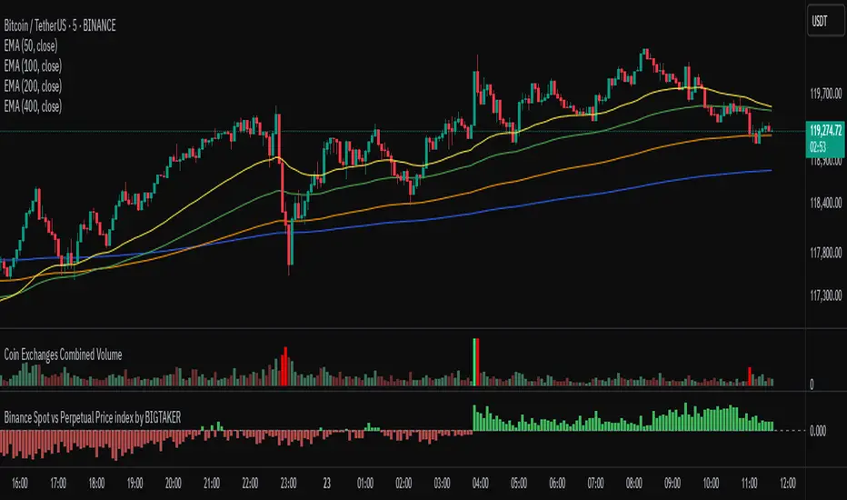
Binance Spot vs Perpetual Price index by BIGTAKER📌 Overview
This indicator calculates the premium (%) between Binance Perpetual Futures and Spot prices in real time and visualizes it as a column-style chart.
It automatically detects numeric prefixes in futures symbols—such as `1000PEPE`, `1MFLUX`, etc.—and applies the appropriate scaling factor to ensure accurate 1:1 price comparisons with corresponding spot pairs, without requiring manual configuration.
Rather than simply showing raw price differences, this tool highlights potential imbalances in supply and demand, helping to identify phases of market overheating or panic selling.
🔧 Component Breakdown
1. ✅ Auto Symbol Mapping & Prefix Scaling
Automatically identifies and processes common numeric prefixes (`1000`, `1M`, etc.) used in Binance perpetual futures symbols.
Example:
`1000PEPEUSDT.P` → Spot symbol: `PEPEUSDT`, Scaling factor: `1000`
This ensures precise alignment between futures and spot prices by adjusting the scale appropriately.
2. 📈 Premium Calculation Logic
Formula:
(Scaled Futures Price − Spot Price) / Spot Price × 100
Interpretation:
* Positive (+) → Futures are priced higher than spot: indicates possible long-side euphoria
* Negative (−) → Futures are priced lower than spot: indicates possible panic selling or oversold conditions
* Zero → Equilibrium between futures and spot pricing
3. 🎨 Visualization Style
* Rendered as column plots (bar chart) on each candle
* Color-coded based on premium polarity:
* 🟩 Positive premium: Light green (`#52ff7d`)
* 🟥 Negative premium: Light red (`#f56464`)
* ⬜ Neutral / NA: Gray
* A dashed horizontal line at 0% is included to indicate the neutral zone for quick visual reference
💡 Strategic Use Cases
| Market Behavior | Strategy / Interpretation |
| ----------------------------------------- | ------------------------------------------------------------------------ |
| 📈 Premium surging | Strong futures demand → Overheated longs (short setup) |
| 📉 Premium dropping | Aggressive selling in futures → Oversold signal (long setup) |
| 🔄 Near-zero premium | Balanced market → Wait and observe or reassess |
| 🧩 Combined with funding rate or OI delta | Enables multi-factor confirmation for short-term or mid-term signals |
🧠 Technical Advantages
* Fully automated scaling for prefixes like `1000`, `1M`, etc.
* Built-in error handling for inactive or missing symbols (`ignore_invalid_symbol=true`)
* Broad compatibility with Binance USDT Spot & Perpetual Futures markets
🔍 Target Use Cases & Examples
Compatible symbols:
`1000PEPEUSDT.P`, `DOGEUSDT.P`, `1MFLUXUSDT.P`, `ETHUSDT.P`, and most other Binance USDT-margined perpetual futures
Works seamlessly with:
* Binance Spot Market
* Binance Perpetual Futures Market
Indicators and strategies
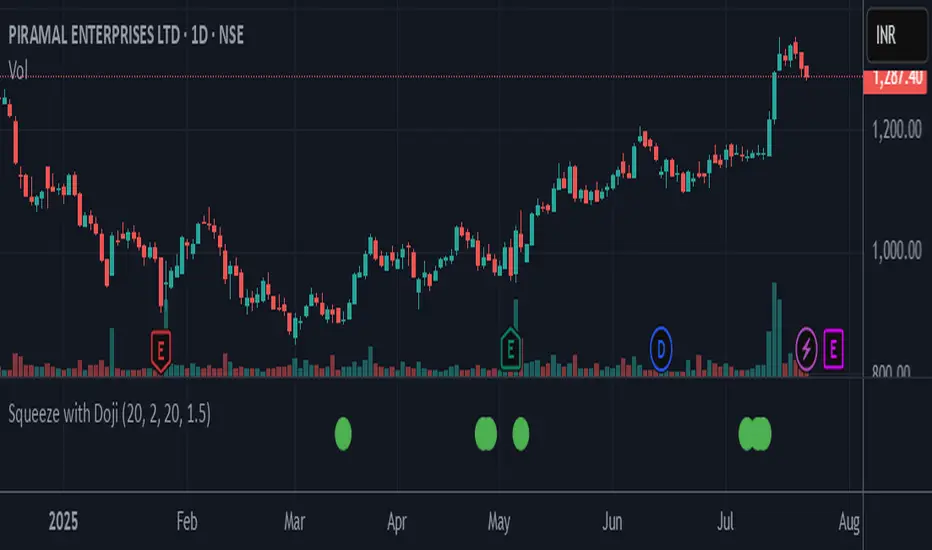
Squeeze with DojiThis script indicates Bollinger band squeeze into Keltner channels to identify the contraction of price and Doji candle formation, potentially leading up to the momentum expansion in price.
Add your preferable volume or price indicators on top of this volatility contraction indicator.
Feel free to use and share your feedback.
TrendShield Pro | DinkanWorldTrendShield Pro is a powerful price action tool that combines momentum-based trend detection with an ATR-powered trailing stop system. Built using EMA and ATR logic, this indicator helps traders identify real trends, manage dynamic stop-loss levels, and react faster to momentum shifts — all with visual clarity.
🔍 Key Features:
✅ Momentum + Price Action Based Trend Detection
✅ Dynamic ATR Trailing Stop Line
✅ Real-Time Reversal Arrows and Diamond Alerts
✅ Optimized CandleTrack color theme (Green = Demand, Red = Supply)
✅ Fully customizable inputs
🧠 Why Use It?
Capture trends early with momentum-driven logic
Use trailing stops for exit strategy or re-entry zones
Stay on the right side of the market with visual confirmation
⚙️ Inputs:
EMA Period (for directional bias)
ATR Period (for volatility-based trailing stops)
Factor (stop distance control)
⚠️ Disclaimer:
This indicator is for educational and informational purposes only and should not be considered financial advice. Trading involves risk, and past performance does not guarantee future results. Always do your own research and consult with a licensed financial advisor before making any trading decisions. The creator of this script is not responsible for any financial losses incurred through the use of this tool.

CandleTrack Pro | Pure Price Action Trend Detection CandleTrack Pro | Pure Price Action Trend Detection with Smart Candle Coloring
📝 Description:
CandleTrack Pro is a clean, lightweight trend-detection tool that uses only candle structure and ATR-based logic to determine market direction — no indicators, no overlays, just pure price action.
🔍 Features:
✅ Smart Candle-Based Trend Detection
Uses dynamic ATR thresholds to identify trend shifts with precision.
✅ Doji Protection Logic
Automatically filters indecision candles to avoid whipsaws and false signals.
✅ Dynamic Bull/Bear Color Coding
Bullish candles are colored green, bearish candles are colored red — see the trend instantly.
✅ No Noise, No Lag
No moving averages, no smoothing — just real-time decision-making power based on price itself.
📈 Ideal For:
Price action purists
Scalpers and intraday traders
Swing traders looking for clear visual bias
─────────────────────────────────────────────────────────────
Disclaimer:
This indicator is provided for educational and informational purposes only and should not be considered as financial or investment advice. The tool is designed to assist with technical analysis, but it does not guarantee any specific results or outcomes. All trading and investment decisions are made at your own risk. Past performance is not indicative of future results. Always do your own research and consult with a qualified financial advisor before making any trading decisions. The author accepts no liability for any losses or damages resulting from the use of this script. By using this indicator, you acknowledge and accept these terms.
───────────────────────────────────────────────────
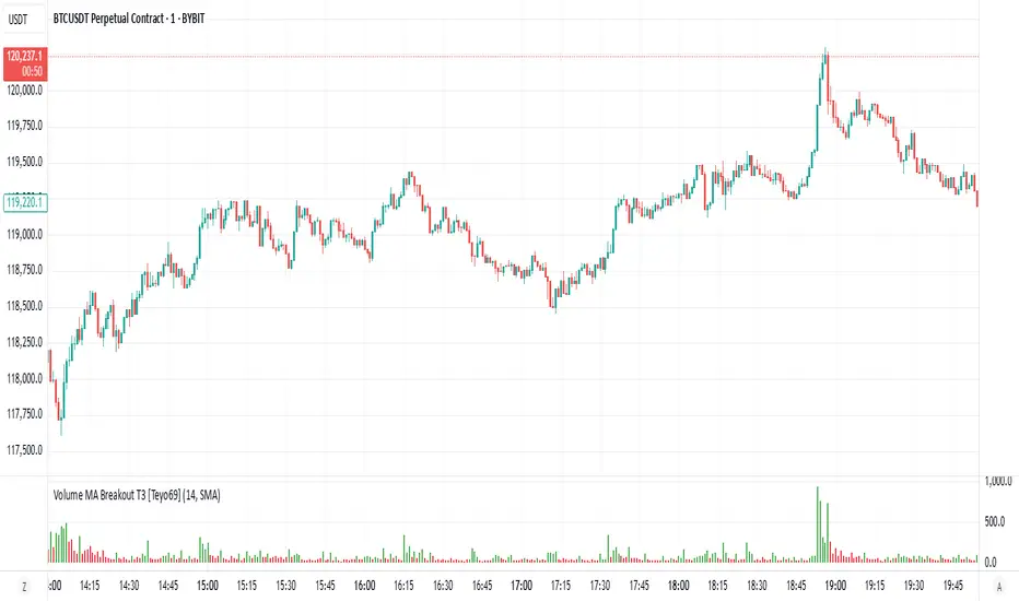
Volume MA Breakout T3 [Teyo69]🧭 Overview
Volume MA Breakout T3 highlights volume bars that exceed a dynamic moving average threshold. It helps traders visually identify volume breakouts—periods of significant buying or selling pressure—based on user-selected MA methods (SMA, EMA, DEMA).
🔍 Features
Volume Highlighting: Green bars indicate volume breakout above the MA; red bars otherwise.
Custom MA Options: Choose between SMA, EMA, or Double EMA for volume smoothing.
Dynamic Threshold: The moving average line adjusts based on user-defined length and method.
⚙️ Configuration
Length: Number of bars used for the moving average calculation (default: 14).
Method: Type of moving average to use:
"SMA" - Simple Moving Average
"EMA" - Exponential Moving Average
"Double EMA" - Double Exponential Moving Average
📈 How to Use
Apply to any chart to visualize volume behavior relative to its MA.
Look for green bars: These suggest volume is breaking out above its recent average—potential signal of momentum.
Red bars indicate normal/subdued volume.
⚠️ Limitations
Does not provide directional bias—use with price action or trend confirmation tools.
Works best with additional context (e.g., support/resistance, candle formations).
🧠 Advanced Tips
Use shorter MAs (e.g., 5–10) in volatile markets for more responsive signals.
Combine with OBV, MFI, or accumulation indicators for confluence.
📌 Notes
This is a volume-based filter, not a signal generator.
Useful for breakout traders and volume profile enthusiasts.
📜 Disclaimer
This script is for educational purposes only. Always test in a simulated environment before live trading. Not financial advice.
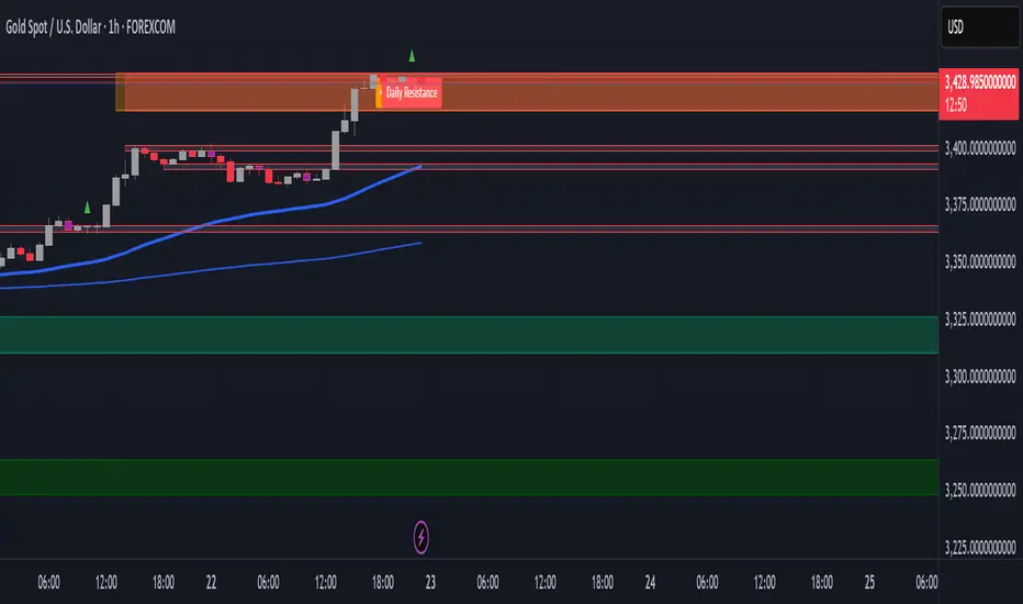
Persistent 1H S/R Zones with Labels (No Overlap) + 50 EMAit helps find recant support and resistance zones with swing points

Persistent Daily & 4H S/R Zones with Labels + 50 EMAit helps find swing high and lows support and ressistsance
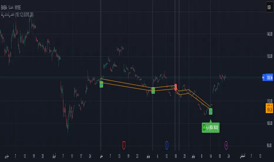
لعلي بابا على ساعة Moving averages indicator for the 10 and 20 averages, relative strength index, and Bollinger Bands Moving averages indicator for the 10 and 20 averages, relative strength index, and Bollinger Bands
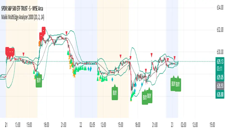
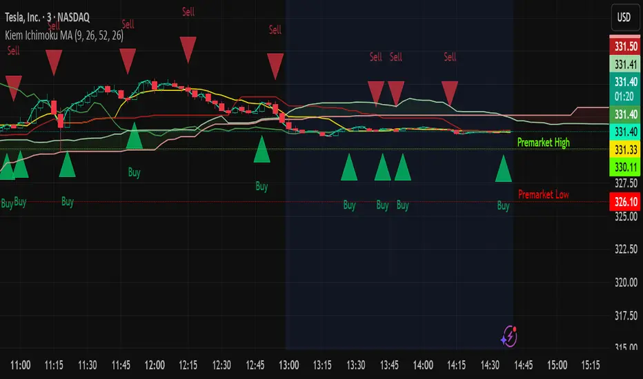
Makki MultiEdge Analyzer 2000This script combines Bollinger Band interactions, RSI momentum confirmation, EMA crossovers, and divergence detection to generate filtered BUY signals. It uses 5-minute and 15-minute timeframe logic to improve timing and reduce false entries.
### 🔹 BUY signal logic:
A BUY label will only appear when:
• Price is near the lower Bollinger Band
• RSI shows a rebound or is climbing from oversold zones
• There is a strong bullish candle, a golden cross (EMA), or a positive divergence
• AND no overbought/exit filter is active
### 💎 Entry filter (diamond):
Appears when a clean bounce is detected on the 5-minute chart.
This is **not a BUY** but a preparation signal — useful to monitor for an upcoming opportunity.
### ⛔ Exit filter:
Triggers when 15m RSI is overbought (>68), price touches the 15m upper Bollinger Band, and 5m momentum weakens.
Blocks BUY signals and helps avoid entries during overextended moves.
### 🔺/🔻 Mild Support/Resistance markers:
- **🔺 Green upward triangle:** appears when RSI rebound or mild support conditions exist, but not enough for a BUY
- **🔻 Red downward triangle:** appears when bearish momentum, EMA crossdown, overbought RSI, or negative divergence is detected
### ❌ RSI Warnings:
- **Orange X above the bar:** RSI > 75 (overbought warning)
- **Orange X below the bar:** RSI < 25 (oversold warning)
### 🧠 Usage recommendation:
- Wait for a 💎 as early preparation
- Enter only if a BUY signal follows with no ⛔ warning present
- Avoid BUYs that appear after ⛔ or during RSI > 75 (orange X) unless very strong reversal confirmation exists
- 🔺 triangles can help monitor early support but are not sufficient alone
### 🕒 Timeframe:
- Best used on 5-minute chart
- Filtering logic pulls RSI and Bollinger data from 5m and 15m timeframes
- Higher timeframes (15m–1H) can be used for overall trend direction
All alerts are included for: BUY, entry filter (💎), exit warning (⛔), RSI warnings (❌), and support/resistance markers (🔺/🔻).
This script is for educational purposes only and does not constitute financial advice.
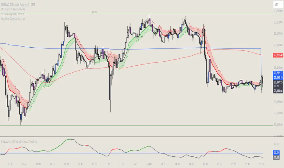
Directional ADX with Dynamic ThresholdThis indicator displays the ADX line, color-coded with a green line indicating a bullish DMI and a red line indicating a bearish DMI. The line turns grey when there is no trend. The trend threshold is determined by ATR. Settings are adjustable. Nothing earth-shattering but this has helped me quite a bit in my trading.
Ichimoku Cloud MAThis chart has a combination of the Ichimoku cloud and Moving Average. This is solely for education and I am not responsible for any losses to users' investments.
Webull-style VWAPThis is a clean, simple VWAP (Volume Weighted Average Price) indicator designed to resemble the VWAP line displayed on the Webull trading platform.
🔷 Includes all trading sessions (regular and extended hours) when enabled on your chart.
🔷 Resets daily at the start of each session.
🔷 Does not include any bands or deviations — just the core VWAP line for clarity.
🔷 Plots directly on your price candles for easy reference.
Perfect for intraday traders who rely on VWAP as a key dynamic support/resistance level and want a TradingView experience closer to Webull’s default implementation.

HeatVOLFirst and foremost, credit goes to xdecow and his great work in the Heatmap Volume indicator. I copied it to make some changes that I wanted (mainly being able to color the volume bars and candlesticks independently).
Overview:
HeatVOL uses statistical analysis to instantly identify significant volume anomalies. By calculating Z-scores (standard deviations from the moving average), it creates a visual heatmap that highlights unusual market activity in real-time. Both candlesticks and volume bars are color-coded based on customizable thresholds, making volume surges immediately visible.
🎨 Visual Heatmap System
- Color-coded candlesticks and volume bars based on volume intensity
- Five threshold levels: Extra High (4σ), High (2.5σ), Medium (1σ), Normal (-0.5σ), and Low
- Multiple display modes: backgrounds, lines, or both
- Customizable colors for all threshold levels
🔔 Smart Alerts
- Set alerts for any threshold level
- Separate alerts for up/down volume bars
- Monitor unusual volume activity across multiple instruments
Use Cases:
- Identify institutional activity and large player participation
- Spot potential breakouts or reversals with volume confirmation
- Monitor volume climax and exhaustion patterns
- Analyze volume trends across different timeframes

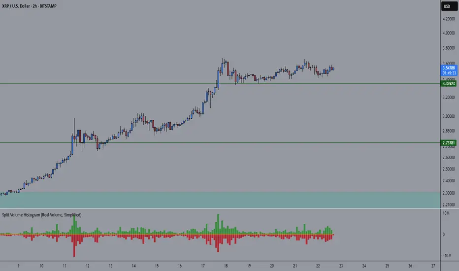
Split Volume Histogram (Real Volume)v2 better volume indicator showing you exactly how much is buy or sell volume at the same time
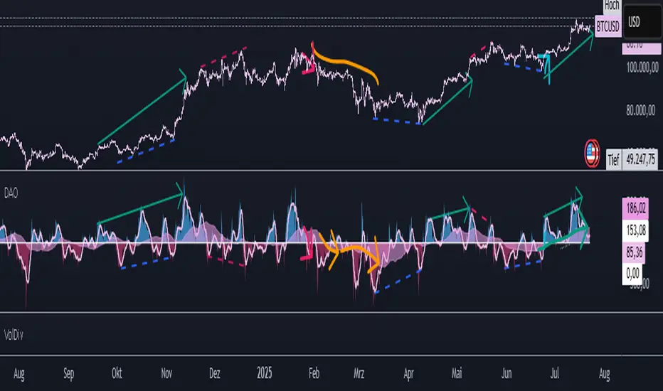
DAO - Directional ATR OscillatorDAO - Directional ATR Oscillator. it combines trenddirection and strength by simply splitting the Average True Range in both directions over an oscilators zeroline with two MAs to make it easier to spot the overall trenddirection together with momentum and strength but it also works great for spotting divergences and possible trendreversals early. have fun with this everything indicator !
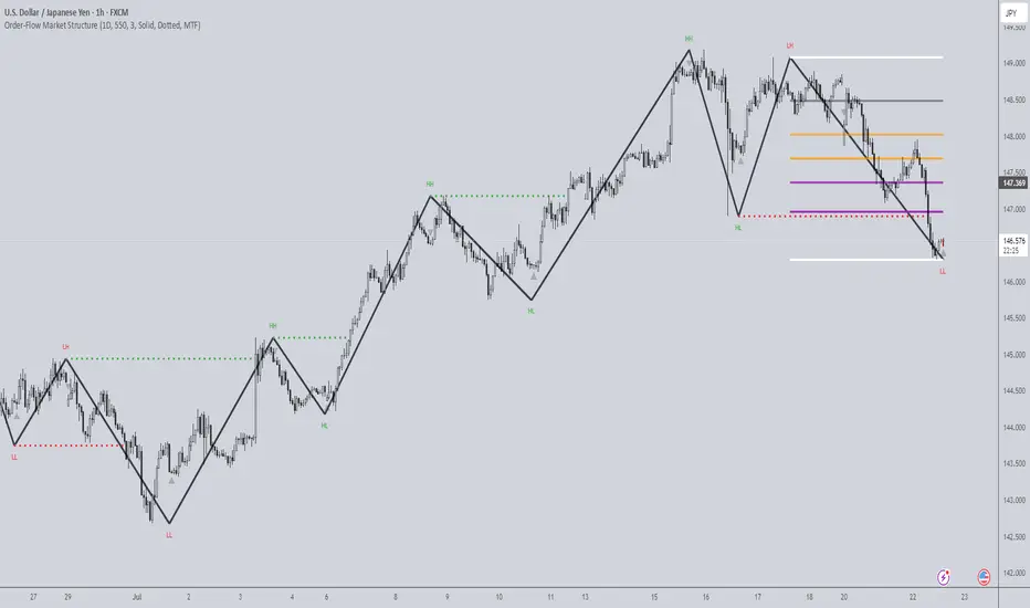
Order-Flow Market StructureOrder-Flow Market Structure by The_Forex_Steward
A precision tool for visualizing internal shifts, swing structure, BOS events, Fibonacci levels, and multi-timeframe alerts.
What It Does
The Order-Flow Market Structure indicator intelligently tracks and visualizes price structure using higher timeframe candles. It automatically detects:
• Internal bullish and bearish structure shifts
• Swing highs and lows (HH, HL, LH, LL)
• Break of Structure (BoS) confirmations
• Fibonacci retracement levels from recent swing moves
• Real-time alerts across LTF, MTF, and HTF modes
It’s a complete tool for traders who follow Smart Money Concepts, ICT, or institutional price action strategies.
How It Works
• You select a Higher Timeframe (HTF) to set the structural context
• Internal shifts are identified using HTF candle closes
• The indicator scans for swing highs/lows after each internal shift
• Breaks of previous swing points confirm BoS and plot horizontal lines
• Zigzag lines visually connect structural points (swings and BoS)
• Fibonacci levels are drawn between the latest swings
• Alerts can be configured for structure shifts, BoS events, and fib level breaks
How to Use It
Set your preferred HTF (e.g., 1H while trading on 5-minute)
Enable Fibonacci levels to visualize retracement zones
Watch for:
• Bullish internal shifts → HL to HH
• Bearish internal shifts → LH to LL
• BOS → Breakout confirmation
Enable alerts to catch structural events in real-time
Adjust the "Safe History Offset" if working with long lookbacks or volatile assets
Who It's For
• Traders using Smart Money, ICT, or market structure-based systems
• Scalpers, day traders, and swing traders
• Anyone needing precise structural insight across multiple timeframes
Features
• BoS detection with custom line styles and width
• HH, HL, LH, LL label plotting
• Optional Fibonacci retracement zones
• Custom alerts for swing shifts and fib level breaks
• LTF, MTF, and HTF alert modes
Stay aligned with structure, trade with precision, and get alerted to key shifts in real time.
MA Crossover with +100 Target Label//@version=5
indicator("MA Crossover with +100 Target Label", overlay=true)
// === Input Parameters ===
shortPeriod = input.int(10, title="Short MA Period")
longPeriod = input.int(100, title="Long MA Period")
pointTarget = input.float(100.0, title="Target Points", step=0.1)
// === Moving Averages ===
shortMA = ta.sma(close, shortPeriod)
longMA = ta.sma(close, longPeriod)
// === Plotting MAs ===
plot(shortMA, title="Short MA", color=color.orange)
plot(longMA, title="Long MA", color=color.blue)
// === Crossover Detection ===
bullishCross = ta.crossover(shortMA, longMA)
bearishCross = ta.crossunder(shortMA, longMA)
// === Variables to Track Entry and Targets ===
var float buyPrice = na
var float sellPrice = na
var bool buyActive = false
var bool sellActive = false
// === On Buy Signal ===
if bullishCross
buyPrice := close
buyActive := true
sellActive := false // Reset opposite signal
sellPrice := na
label.new(bar_index, low, "Buy", style=label.style_label_up, color=color.green, textcolor=color.white)
// === On Sell Signal ===
if bearishCross
sellPrice := close
sellActive := true
buyActive :=

RSI, CCI, ADX Panel (Custom TF for Each)RSI, CCI, and ADX Combined – Multi-Timeframe, Fully Customizable Panel Indicator for TradingView
Overview
This Pine Script indicator integrates the Relative Strength Index (RSI), Commodity Channel Index (CCI), and Average Directional Index (ADX) into a single, clean panel for effortless technical analysis. Each indicator operates independently, with customizable length, smoothing, and time frame for maximum flexibility. Traders can now monitor momentum, trend strength, and overbought/oversold conditions across different time frames—all in one place.
Key Features
Independent Controls: Set length, smoothing (ADX), and time frame individually for each indicator via the settings panel.
Multi-Timeframe Support: Each oscillator (RSI, CCI, ADX) can be calculated on its own time frame, enabling nuanced inter-timeframe analysis.
Customizable Visualization: Adjust line color and thickness for each indicator to match your chart style.
Clean, Non-Overlay Display: All three indicators are plotted in a dedicated panel beneath the price chart, reducing clutter.
Reference Levels: Includes standard reference lines for oversold/overbought (RSI, CCI) and trend threshold (ADX) for quick visual cues.
Usage Ideas
Swing Trading: Compare short- and long-term momentum using different time frames for RSI, CCI, and ADX.
Trend Confirmation: Use ADX to filter RSI and CCI signals—only trade overbought/oversold conditions during strong trends.
Divergence Hunting: Spot divergences between time frames for early reversal signals.
Scalping: Set RSI and CCI to lower time frames for entry, while monitoring higher timeframe ADX for trend context.
How to Install
Paste the script into the Pine Editor on TradingView.
Add to chart. Adjust settings as desired.
Save as a template for quick reuse on any chart—all your custom settings will be preserved.
Customization
Edit lengths and time frames in the indicator’s settings dialog.
Toggle reference lines on/off as needed.
Fine-tune line appearance (color, thickness) for clarity.
Note:
This indicator does not provide automated buy/sell signals. It is a customizable analytical tool for manual or semi-automated trading. Use in combination with other technical or fundamental analysis for best results.
Combine Momentum, Trend, and Volatility—Seamlessly and Visually—With One Indicator.

Two MA Crossover with Labels//@version=5
indicator("Two MA Crossover with Labels", overlay=true)
// === Input Parameters ===
shortPeriod = input.int(10, title="Short MA Period")
longPeriod = input.int(100, title="Long MA Period")
// === Moving Averages ===
shortMA = ta.sma(close, shortPeriod)
longMA = ta.sma(close, longPeriod)
// === Plotting MAs ===
plot(shortMA, color=color.orange, title="Short MA")
plot(longMA, color=color.blue, title="Long MA")
// === Crossover Conditions ===
bullishCross = ta.crossover(shortMA, longMA)
bearishCross = ta.crossunder(shortMA, longMA)
// === Labels ===
if bullishCross
label.new(bar_index, low, "Buy", style=label.style_label_up, color=color.green, textcolor=color.white)
if bearishCross
label.new(bar_index, high, "Sell", style=label.style_label_down, color=color.red, textcolor=color.white)
Period Separator with DatesSimple period separator with dates. You can customize lines and colours. Feel free to customize and share your thoughts in the comment section. Remember time is the only thing you need to master the markets. Keep your charts clean and enjoy trading! ;)
D-LevelsThis indicator accepts a comma-separated list of price ranges as input and visualizes each range as a distinct zone on the chart, using randomized colors for distinction.
Enhanced Order Block Zones v6I created this indicator to identify orders blocks and label them on timeframes of 15 minutes and lower. This only identifies fairly recent orders blocks based off the performance of the markets. Always remember orders blocks are more accurate at higher timeframes. However, this can be utilized to see more real time orders blocks as they form.
