Indicators and strategies

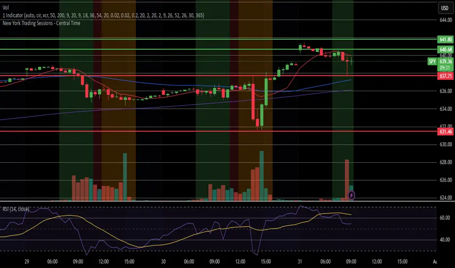
Pre-Market & Previous Day Levels 300here is the indicator pre market high low and prev day hihg low levels
Coefficient of Variance BarsThe script calculates the Coefficient of Variance (CV), which is the standard deviation (a measure of volatility) divided by the average price over a set period. In simple terms, it tells you how volatile the market is in relation to its current price level.
• Highlighting Volatility Increase: By default, the script colors the bars when this relative volatility makes a new high. This suggests that the market is "waking up" and that a significant price move could be starting.
• Highlighting Low Volatility (Inverse Mode): When you uncheck the box in the settings, it highlights periods where volatility is not making a new high. This is useful for spotting quiet, consolidating markets.
________________________________________
How to Use It in Trading
This indicator is a complementary tool and should be used with other forms of analysis, like price action or trend indicators.
1. Spotting Potential Breakouts
The most common use is to anticipate breakouts. When the price is moving in a tight range (consolidation) and you suddenly see a highlighted bar, it signals a surge in volatility. This is often the catalyst that pushes the price out of the range.
• Strategy: Look for a period of price consolidation. When a bar is colored, indicating a volatility spike, look for a confirmation of a breakout (e.g., a candle closing above resistance or below support) and consider entering a trade in that direction.
2. Identifying Ranging Markets
By switching to the inverse mode, you can easily see when the market is quiet and range-bound.
• Strategy: When the bars are consistently highlighted in inverse mode, it confirms a ranging market. This is the ideal environment for strategies that capitalize on sideways movement, such as using oscillators (like RSI or Stochastics) to trade between support and resistance levels.
3. Gauging Trend Strength and Exhaustion
In a strong, ongoing trend, you'll likely see intermittent volatility spikes confirming the momentum. However, a sudden, massive spike in volatility after a very long trend might signal a "climax," potentially indicating the trend is exhausted and a reversal could be near.
VWAP Multi-Period with SD & Value ZonesVWAP Multi-Period with SD & Value Zones
A dynamic VWAP indicator that works on Weekly, Monthly, Quarterly (3M) and Yearly (12M) timeframes.
VWAP line: true volume-weighted average price
±1, ±2, ±3 SD bands: volume-weighted volatility levels
Value Zone: filled area between ±1 SD
Prior Value Zone: last period’s ±1 SD area extended into the new period
Usage: Add to chart, select your period (W/M/3M/12M), and use the bands and zones as volume-weighted support/resistance and risk boundaries.
Demander à ChatGPT


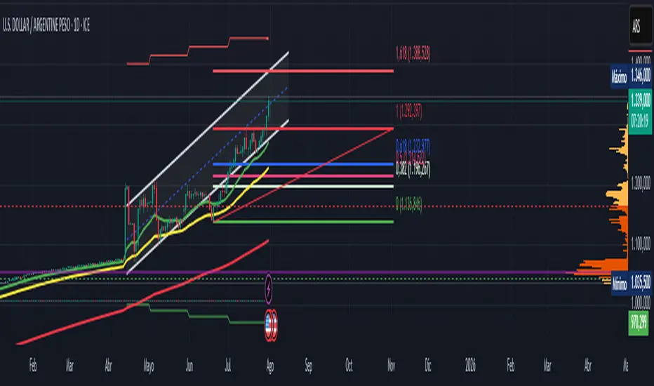
Official USD Staggered Bands - ArgentinaOfficial USD Staggered Bands - Argentina
The Central Bank, under the administration of Javier Milei (La Libertad Avanza), announced on Friday, April 11, 2025, a series of measures to eliminate the so-called "exchange rate restriction."
In this new phase, the dollar's exchange rate on the Free Exchange Market (MLC) will be able to fluctuate within a band between $1,000 and $1,400 , the limits of which will be expanded at a rate of 1% monthly.
The lines evolve daily, increasing as the public administration predicts. This way, you can know the likelihood of a Central Bank intervention to correct the variation and return the peso to a price within the band.
The script runs under the ticker USDARS
Dollar Bands [TNI]This script shows divergences bands implemented by Argentine Goverment this year for the Argentine Currency USDARS.
You can change the fix monthly and date/price init, and create upper or lower band cross alerts.

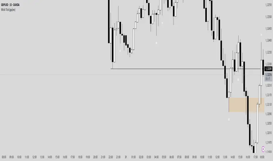
Wick TickMy indicator shows the tick size of the candle wick. In the settings, you can specify how many ticks to display information on the screen.
Night Session Highlight with Timezone (Valehson)Highlights this time range from 21:00 to 09:00 with a gray background with 90% transparency.
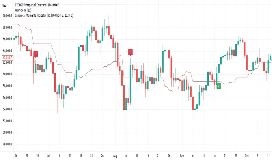
Canonical Momenta Indicator [T1][T69]📌 Overview
The Canonical Momenta Indicator models trend pressure using a Lagrangian-based momentum engine combined with reflexivity theory to detect bursts in price movement influenced by herd behavior and volume acceleration.
🧠 Features
Lagrangian-based kinetic model combining velocity and acceleration
Reflexivity burst detection with directional scoring
Adaptive momentum-weighted output (adaptiveCMI)
Buy 🐋 / Sell 🐻 labels when reflexivity confirms direction
Fully parameterized for customization
⚙️ How to Use
This indicator helps traders:
Detect reflexive bursts in market activity driven by sharp price movement + volume spikes
Capture herd-driven directional moves early.
Gauge market pressure using a kinetic-potential energy model.
Suggested signals:
🐋 Reflexive Up: Strong bullish momentum spike confirmed by volume and positive lagrangian pressure
🐻 Reflexive Down: Strong bearish dump confirmed by volume and negative lagrangian burst
🔧 Configuration
MA Lookback Length - Smoothing for baseline price & energy calculation
Reflexivity Momentum Threshold - Price momentum trigger for burst detection
Reflexivity Lookback - Period over which bursts are counted
Reflexivity Window - Minimum burst sum to trigger signal label
Volume Spike Threshold - % above average volume to qualify as burst
📊 Behavior Description
The indicator computes a Lagrangian energy:
Kinetic Energy = (velocity² + 0.5 * acceleration²)
Potential Energy = deviation from moving average (distance²)
Lagrangian = Potential − Kinetic (higher = overextension)
Then, reflexive bursts are triggered when:
Price is rising or falling over short window (burstMvmnt)
Volume is above average by a user-defined multiple
Each bar gets a burst score:
+1 for up-burst
−1 for down-burst
0 otherwise
⚠️ Risk Profile Based on Lookback Settings
Risk Level | Description | Recommended Lookback
🟥 High | Extremely sensitive to bursts, prone to false signals | 7–10
🟨 Moderate | Balanced reflexivity with trend confirmation | 11–20
🟩 Low | Filters out most noise, slower to react | 21+
🧪 Advanced Tips
Combine with moving average slope for trend filtering
Use divergence between adaptiveCMI and price to detect exhaustion
Works well in crypto, commodities, and volatile assets
⚠️ Limitations
Sensitive to high volatility noise if volMult is too low
Designed for higher timeframes (1H, 4H, Daily) for reliability
Doesn’t confirm direction in sideways markets — pair with other filters
📝 Disclaimer
This tool is provided for educational and informational purposes. Always do your own backtesting and use proper risk management.
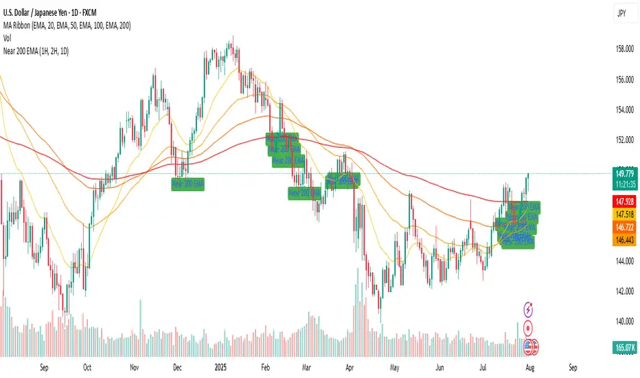
Near 200 EMA (1H, 2H, 1D) (Aditi Varshney )it will show if the price of script is near 1 h , 2 h , and 1 D or not .
ALPHA 999This script is a custom-built indicator designed to enhance your trading strategy by providing . It is optimized for and suitable for both intraday and swing traders.

Color Change EMA 200 (3 Min)- EMA 200 locked on 3 minute time frame
- Color changes red when bearish, and green when bullish.
Combined Time and Price IndicatorCammjayyy THis is a time frame indicator that changes the colors based on day highs and lows. really good for swings and hedging

Buy/Sell Signal - Advanced v2The Buy/Sell Signal – Advanced v2 indicator is a powerful tool designed for traders who seek more reliable and filtered entries. This indicator combines classic technical analysis with modern enhancements to reduce noise and false signals. It generates Buy signals when a bullish candle closes above the 14-period Simple Moving Average (SMA), the RSI is below the oversold threshold (default: 30), and trading volume is higher than the 20-period average—indicating strong momentum and potential reversal from a discounted price zone. Conversely, a Sell signal appears when a bearish candle closes below the SMA, RSI is above the overbought level (default: 70), and volume exceeds its average—signaling potential weakness after a price rally.
In addition to entry signals, the indicator automatically plots dynamic support and resistance levels using pivot highs and lows. These levels help traders identify key zones for confirmation, breakout, or rejection. The SMA provides trend direction context, while the volume and RSI filters act as safeguards to avoid trading in low-quality conditions.
Ideal for scalpers and intraday traders on 5-minute to 1-hour timeframes, this indicator helps capture trend continuations and early reversals with confidence. For best results, use the signals in conjunction with multi-timeframe analysis and price action confirmation. This tool is especially effective on assets like XAUUSD, forex pairs, and indices.

Dynamic Gap Probability Tool with N-Bar Decay📌 How It Works
1. Moving Average (MA) Reference
o The indicator plots a moving average (SMA, EMA, WMA, etc.) on the chart.
o Price can be above or below this moving average.
2. Probability Tracking
o Every time a bar closes, the script records:
Whether the next candle closed up (green) or down (red).
Whether within the next N bars (e.g., 3 bars ahead) the price moved higher or lower than the current close.
3. N Bar Lookahead
o Instead of only caring about the very next candle, it looks forward several bars to see if the market eventually moves in your favor.
o Example: If N = 3, it answers:
"Within the next 3 bars, what’s the chance price will go higher/lower from here?"
4. Results Table
o At the edge of your chart, the table shows:
✅ Next Green % – Probability next candle is bullish.
❌ Next Red % – Probability next candle is bearish.
📈 N Bar Bull % – Probability that within N bars, price goes higher.
📉 N Bar Bear % – Probability that within N bars, price goes lower.
💡 Why It’s Useful for Traders
• Removes Guesswork – Instead of relying on “gut feeling,” you see historical probabilities for how price reacts when above/below the MA.
• Better Trade Timing – If N Bar Bullish Probability is high, it suggests waiting for confirmation and holding longer than just 1 candle.
• Adapts to Style –
o Scalpers: Use N = 1 to see immediate probabilities.
o Swing Traders: Use N = 3, 5, or 10 to see longer-term reaction probabilities.
• Trend Awareness – Works differently above and below the moving average, giving you a bias toward long or short trades.
• Confidence in Decisions – Probabilities are based on real past data from the chart’s history.

Fractals [Dova Lazarus]🔹 Fractals — a lightweight and efficient indicator that plots classic Bill Williams-style fractals.
Perfect for identifying local reversal points on the chart.
Simple visualization with triangle markers above and below candles.

RSI TrendsColor chart with RSI colors
Simple RSI which colors green candle when RSI above 65, red when below 35 and grey when in between.
MACD + EMA Zone Filter (with EMAs)How it works:
It plots 4 EMAs (Exponential Moving Averages):
EMA 20 (orange)
EMA 50 (yellow)
EMA 100 (blue)
EMA 200 (red)
A Buy signal is triggered when:
All three EMAs (20, 50, 100) are above EMA 200 (indicating an uptrend)
The MACD line crosses above the Signal line (bullish momentum)
A Sell signal is triggered when:
All three EMAs (20, 50, 100) are below EMA 200 (indicating a downtrend)
The MACD line crosses below the Signal line (bearish momentum)
📊 Visual Features:
Buy/Sell arrows directly on the chart
Background turns green in strong uptrends and red in strong downtrends
Built-in alerts for automation or notifications
🕒 Works on any timeframe, using the current chart's data.
use with fractals indicator for SL, aim for 1:2 RR

MultiMa FxGMulti Moving Average v1
SMA 8 + EMA 21 + EMA 50
Cet indicateur permet de condenser 3 indicateurs en 1 seul.
C'est un test permettant de voir comment cela se comporte dans la réalité de TradingView
================================================================================
Multi Moving Average v1
This indicator is designed for draw 3 moving average with this custom indicator.
This is my first try on TradingView Pine Script.
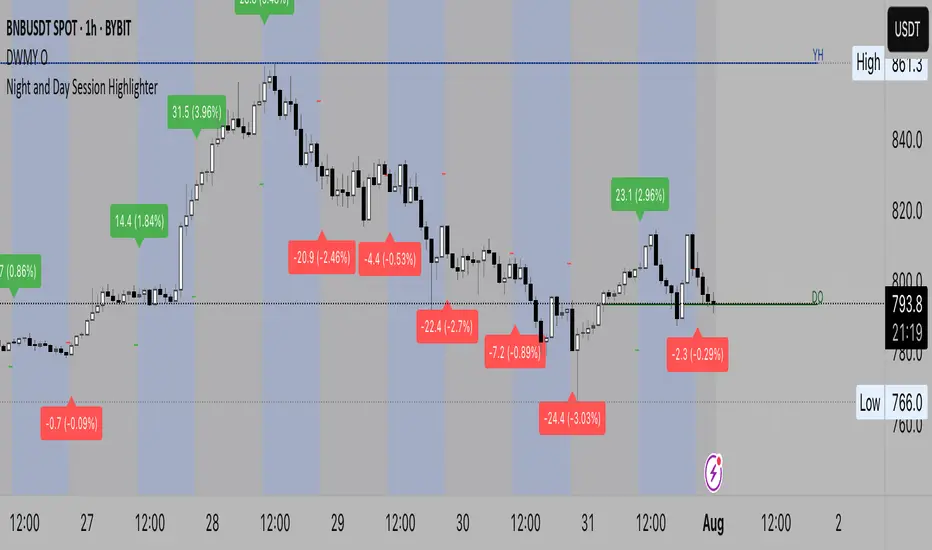
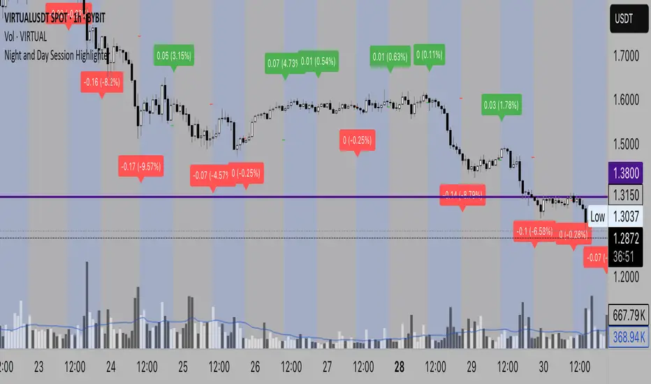
Night and Day Session Highlighter % (Valehson)- This script splits the day into night and day sessions and displays the price change in percentage.
- Этот скрипт разделяет день на вечерние и дневные сессии и показывает изменение цены в процентах.